In the designer's own words: Our solution was inspired by a Jekyll & Hyde like personality, where the chef role is represented by a chefs hat, and with a clever twist, becomes the top hat for role of connoisseur. Both roles were represented in their own typeface.
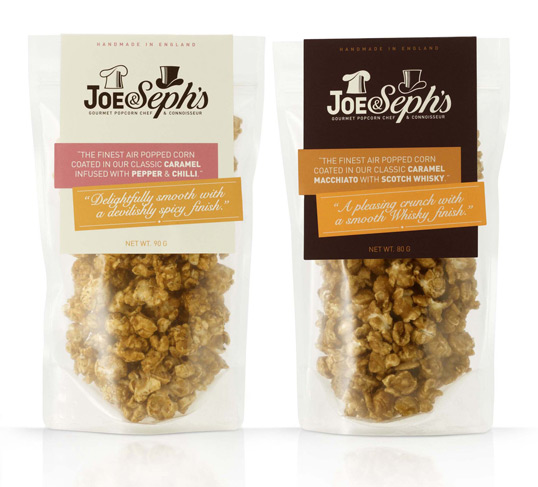
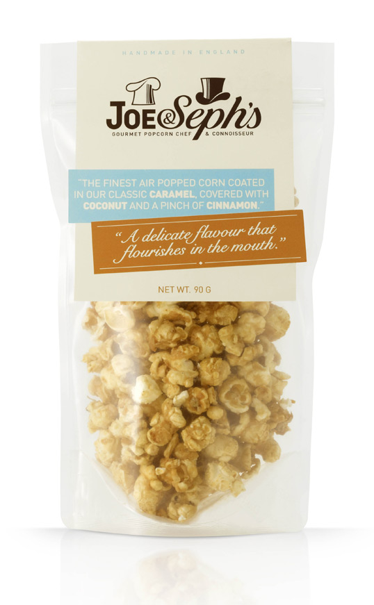
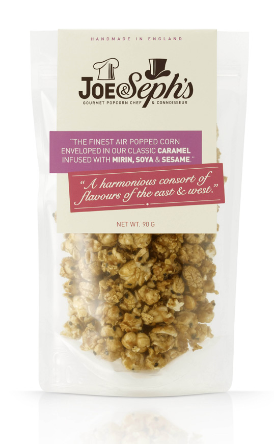
I love how much thought went into developing this packaging and the logo. The Jekyll/Hyde symbolism is cleverly executed without looking cheesy or gimmicky. What do you think of the packaging for Joe & Seph's?
images via Lovely Package
No comments:
Post a Comment